In this blog post, I want to summarize the new releases from the Google tools, that we use daily in datadice. Therefore I want to give an overview of the new features of BigQuery, Looker Studio, Google Analytics and Google Tag Manager. Furthermore, I will focus on the releases that I consider to be the most important ones and I will also name some other changes that were made.
If you want to take a closer look, here you can find the Release Notes from BigQuery, Looker Studio, Google Analytics & Google Tag Manager.
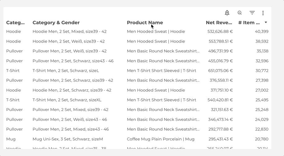
BigQuery
Chart tab in the query result
When you see the result of a successful query execution, there is a new tab available.

There you can choose between a bar chart and a line chart. Then you have to set one dimension and you can add up to 5 metrics. Then you see something like this:

It is an excellent opportunity to make some small checks on your data. When you need insights into a new table, this is a powerful tool to get an overview of the data, especially about the distribution of data. It isn’t meant as a replacement for professional data visualization tools, but it’s still very useful.
New LIKE operator
There are two new Like operators available to filter your data more preciously. The two operators are LIKE ANY/LIKE SOME and LIKE ALL.
An example of LIKE ANY (LIKE SOME is just a synonym):
SELECT shipping_city, COUNT(DISTINCT order_id) AS count_orders
FROM `project_name.dataset_name.order`
WHERE shipping_city LIKE ANY ('%burg%', '%A%')
GROUP BY 1
ORDER BY 2 DESC
Result: It shows all shipping cities that have “burg” OR “A” inside the name.

The other operator is LIKE ALL
SELECT shipping_city, COUNT(DISTINCT order_id) AS count_orders
FROM `project_name.dataset_name.order`
WHERE shipping_city LIKE ALL ('%burg%', '%A%')
GROUP BY 1
ORDER BY 2 DESC
Result: It shows all shipping cities that have both “burg” AND “A” inside the name.

Data profiles and data quality analysis
When you look at a table in BigQuery you can see two new tabs:

Important: To get insights you have to enable the Dataplex API which inflicts costs over time.
We will do a detailed blog post about these two tools later. Just a quick overview:
Data Profile:
- A tool to understand your data
- You can create, view, and manage certain data profile scans
- Per scan, you can define the scope, filters, sampling size, and schedule of it
Data Quality:
- A tool to prove the correctness of your data
- You can create, view, and manage certain data quality checks
- Per check, you can define the scope, filters, sampling size, and schedule of it
Here you can find the documentation for Data Profile and Data Quality.
Duet AI
With the new collaborator from Google, Duet AI, you can get assistance during the SQL code development. The AI can complete, generate, and explain SQL queries.
To activate Duet AI in your projects, you have to do the following:
- You need to apply for Duet AI by filling out the form and waiting until you get the confirmation
- Open a Cloud Shell and execute the following command: gcloud services enable cloudaicompanion.googleapis.com
- When the operation is finished, you see on the top right corner of the screen the icon for the AI Assistant

We are still on the waitlist for the preview program, but we are looking forward to getting access to it.
Here you can find the documentation for it.
BigQuery Studio
I just want to mention BigQuery Studio as well, because its full potential still needs to be clarified and you have to try it out yourself.
The idea of it is to access/integrate certain Google Cloud services in BigQuery directly. Examples of services are:
- Colab Enterprise Python notebooks for immediate Python development runtimes
- The mentioned data profiles, data quality scans, and the Duet AI features are part of it as well
Further information can be found here.
Other changes
BigQuery got a lot of updates I want to mention here:
- BigQuery DataFrames is a Python API to get insights into data and execute ML tasks
- Data clean rooms to have a secure environment to work on data together (part of Analytics Hub)
- A lot of new BigQuery ML features like new text embedding features, import of new kinds of models, language processing, translation and computer vision in BQ via Vertex AI pre-trained models, and many more
- Create your own masking routines with a REGEXP_REPLACE scalar function
- You can use the EXPORT DATA statement to export BigQuery data to Bigtable
Dataform
Small changes
Dataform brought some small improvements into the ecosystem that I would like to describe shortly:
- It is possible to connect the repository with Bitbucket now
- You can authenticate to all different repository providers via SSH
- In the list of all available repositories in Dataform, you can filter and sort the list individually

Looker Studio
New Boxplot chart type
Google added a lot of new chart types to Looker Studio and first, we will take a look into the Boxplot charts.
Here is first an example of a boxplot chart in Looker Studio, which shows the forecasted revenue of a company:

And the corresponding data:

The boxplot chart needs 1 dimension (in this case the month) and has 5 metrics you have to select. The 5 metrics are different ranges of value and then you have the following parts in the chart:
- The start of the line is the minimum
- The start of the square is the lower percentile
- The line in the square is the median
- The end of the square is the higher percentile
- The end of the line is the maximum
New Candlestick chart type
Quite similar to the Boxplot chart is the candlestick chart
Here is the candlestick chart, quite similar to the boxplot example:

And the corresponding data:

It has the same structure as the boxplot chart, except we just need 4 metrics. The missing metric is the median, so we have no line in the squares.
New Waterfall chart type
The waterfall chart is different but has also the idea of showing the evolution of a metric over time.
Here is an example of a Waterfall chart:

And the corresponding chart:

Waterfall charts are appropriate when there are negative and positive values for the metric and/or when the value should be accumulated over time. The total bar at the end of the file is optional and you can select it in the settings.
If you want to see all the new chart types in one dashboard, you can take a look here.
Google Analytics
Behavioral modeling
One of the most frequently used reports in Universal Analytics was the Funnel Exploration, where you see how many users/sessions start and go through different steps on your website until the conversion happens.
This report is available in GA4 now as well. You can find it in the section Monetisation > User purchase journey.

One problem is that this report is static and the steps can not be changed. If you need custom funnel reports you can create them in the exploration mode.

Audience report
There is a new standard report for your created audiences available. Under User > User Attributes > Audiences you can find the report and has the usual layout. A time-series chart at the top and a detailed table underneath it.

New conditions available in reports
Google added already In custom reports the filter option. The filter got some new options like “begins with”, “exactly matches” and regex.
At the beginning of Google Analytics 4, the custom report creator was super limited. Now with the filter option, among other things, these reports are more powerful to have a more detailed analysis for your use cases.

Google Tag Manager
Transformations in server-side container
There is a new layer between clients and tags in the server container called Transformations.
Transformations have the task of interacting in several ways with the event data. You can define which event data you want to add, change, or exclude.

And here you can change for example certain event data:

If you want to activate these Transformations you can assign them:
- In general (for all tags)
- Just to some tag types (GA4, FB, GAds, …)
- Just to certain tags
The transformations were a missing piece to have cleaned data for your tags, which they can use. It is useful especially to have more control over which tags have access to which data.
Further Links
This post is part of the Google Data Analytics series from datadice and explains to you every month the newest features in BigQuery, Data Studio, Google Analytics and Google Tag Manager.
Follow us on LinkedIn for insights into our daily work and important updates on BigQuery, Data Studio, and marketing analytics.
Subscribe to our YouTube channel for discussions on DWH, BigQuery, Looker Studio, and Google Tag Manager.
If you are interested in learning BigQuery from scratch, get access to our free BigQuery Course
Elevate your skills with Google Data Studio and BigQuery by enrolling in our Udemy course.
Need help setting up a modern, cost-efficient data warehouse or analytical dashboard? Email us at hello@datadice.io to schedule a call.